You can anchor your wall with large-scale art that commands attention and grounds the room.
Build a gallery wall gradually, mixing frame styles and artwork types to create a living narrative.
Add a console table as your foundation, layering it with decorative objects and lighting.
Introduce texture through grasscloth wallpaper, which provides depth and hides imperfections.
Use mirrors strategically to reflect light and expand perceived space.
Embrace minimalism by choosing one carefully placed piece instead of crowding the wall.
Each approach creates visual balance while defining your room’s purpose and style—select which method works best for your space.
Anchor the Wall With Large-Scale Art
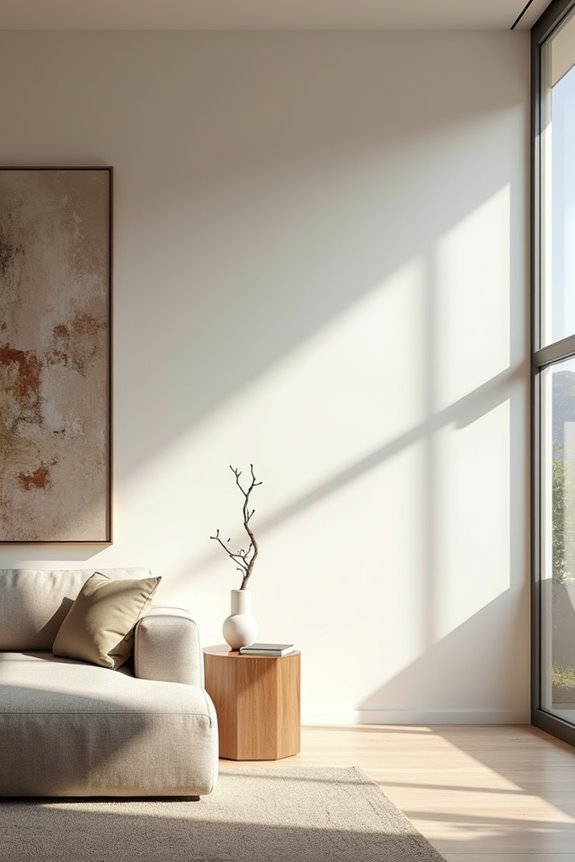
How do you turn a bare wall into a purposeful design element? Large-scale art serves as an effective anchor, creating visual interest and defining your living room’s character. Oversized artwork draws the eye naturally, establishing a focal point that grounds the entire space.
Position one substantial piece as your wall anchoring solution. The artwork accomplishes this because it commands attention and prevents the room from feeling incomplete. Pair your selection with a picture light to emphasize the art further.
If you’re considering two pieces, space them no more than four inches apart. Center the middle point on your wall for cohesive visual balance. Align your oversized artwork with nearby furniture—like your sofa or credenza—to avoid a top-heavy appearance. This strategic placement creates harmony throughout your room.
Build a Gallery Wall That Grows With You
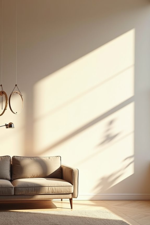
You build a gallery wall that grows by mixing frame styles and artwork types intentionally, creating visual interest without committing to a permanent design. This approach works because you can add pieces gradually—pairing vintage finds with newer works—and rotate art using systems like Wexel Art for frequent updates. Your personal collection defines the wall’s narrative, so each piece you select tells a story that evolves with your life and taste.
Curate Personal Collections Over Time
What if your wall became a living record of what matters to you? A gallery wall with mixed frames creates depth without demanding perfection. You’ll find varied styles—wood, metal, painted finishes—at local antique malls, each piece telling its own story. The mixed frames do more than decorate because they reflect genuine taste rather than sterile uniformity.
Personal collections develop naturally when you add art gradually. Larger pieces with breathing space between them prevent visual overwhelm on a 12–to–15 foot wall. Incorporate art rotation through adjustable hanging systems or interchangeable frames, letting children’s drawings and family photos cycle in without reconfiguring everything.
Position a bench nearby to anchor the vignette. This seating encourages you to pause, reflect, and plan future additions. Your gallery wall defines your evolving story, growing alongside life’s changes.
Mix Frames and Artwork Styles
Gallery walls aren’t bound by rigid rules or matching sets. You can mix frames in different woods, metals, and finishes to create visual interest. Combining artwork styles—original paintings, vintage prints, local antiques—builds a collection that reflects your taste.
Rotation-friendly framing systems let your gallery wall develop over time. Floating frames and Wexel Art–style displays allow you to swap pieces seasonally without permanent commitment. This flexibility adapts as your preferences shift.
Arrange larger pieces on top rows with smaller frames below. Space pieces no more than four inches apart so they read as one unified unit. The varied styles create texture and depth that uniform grids cannot. A picture light spanning two-thirds of the width illuminates everything evenly, highlighting your collection’s diverse materials and tones.
Add Storage That Works as Wall Decor
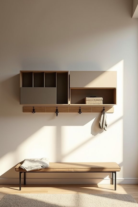
How can a blank wall serve double duty? By combining wall storage with wall decor, you create functional spaces that organize your home while looking deliberate.
Open shelving displays your book collection while providing practical storage. A cozy bench beneath the shelves creates casual seating and hidden storage simultaneously. The storage bench does double work because it solves two problems at once—seating and organization.
Install a narrow console with hooks above to corral keys, mail, and everyday items. Decorative baskets on lower shelves contain smaller objects while adding texture and color to your display. A compact storage unit like a slim cabinet maximizes organization without overwhelming your wall space.
These solutions show how wall storage becomes wall decor, turning empty space into purposeful design that serves your daily needs.
Add Warmth and Depth With Texture
You can update your empty wall by adding grasscloth wallpaper or other textured materials that create visual interest without overwhelming the space. Texture works because it introduces depth and warmth by contrasting smooth painted surfaces with tactile finishes, which defines the room’s character. Layering your textured wall with complementary furnishings—like stone accents, wood pieces, or fabric elements—builds a coordinated look that allows larger decorative items to stand out.
Grasscloth Wallpaper Solutions
When texture matters more than pattern, grasscloth wallpaper turns an empty wall into a functional design feature. You’re creating visual interest without relying on bold colors or busy prints.
Grasscloth wallpaper solutions offer practical benefits:
- Hides imperfections: The woven texture masks minor wall damage and reduces the need for extensive prep work.
- Supports multiple styles: Natural fibers complement mid-century, traditional, and contemporary decor equally well.
- Softens architectural lines: Textured wall decor visually rounds sharp edges and creates a cohesive room backdrop.
The material does this because its organic weave catches light differently than flat paint. You’ll notice how grasscloth defines space without overwhelming large walls. This wallpaper backsplash approach works particularly well when you want warmth without pattern. Your living room gains depth and tactile richness that anchors furnishings around it.
Textural Wall Treatment Benefits
Why settle for flat paint when texture creates visual depth that changes your entire room? Grasscloth wallpaper and similar wall treatments introduce subtle dimension that anchors your space. The textured backdrop does this because natural materials reflect light differently across their surfaces, making walls feel less static and more deliberate.
Texture adds warmth to neutral palettes without requiring bold color changes. Your grasscloth wall treatment defines the room’s character while supporting whatever you display—art, shelving, or textiles. This versatile foundation prevents your decor from feeling disconnected or sparse.
Light-filled rooms particularly benefit from textural wall coverings since sunlight emphasizes shadows and highlights across the surface. The result? A living room where texture provides both visual interest and practical design solutions for arranging furnishings and accessories in harmony.
Layering Texture With Furnishings
Layering Texture With Furnishings
A textured wall backdrop only reaches its full potential when furnishings work alongside it. You’ll create visual harmony by selecting pieces that echo the wall’s tactile qualities without competing for attention.
Consider these layering approaches:
- Place woven yarn art or fabric wall panels beside wooden furniture to reinforce natural textures
- Layer neutral upholstery with patterned throw pillows that complement grasscloth or textured wallpaper
- Position shelving units displaying books and ceramics to add depth without overwhelming the space
The wall defines the room’s foundation because it anchors your decor choices. Your empty wall becomes a design backbone when you thoughtfully select furnishings that share similar material qualities—wood grain, linen, or woven elements. This coordinated approach enriches the space while maintaining visual balance. Texture layering succeeds when each piece supports rather than dominates the overall composition.
Make the Room Feel Bigger With Mirrors and Light
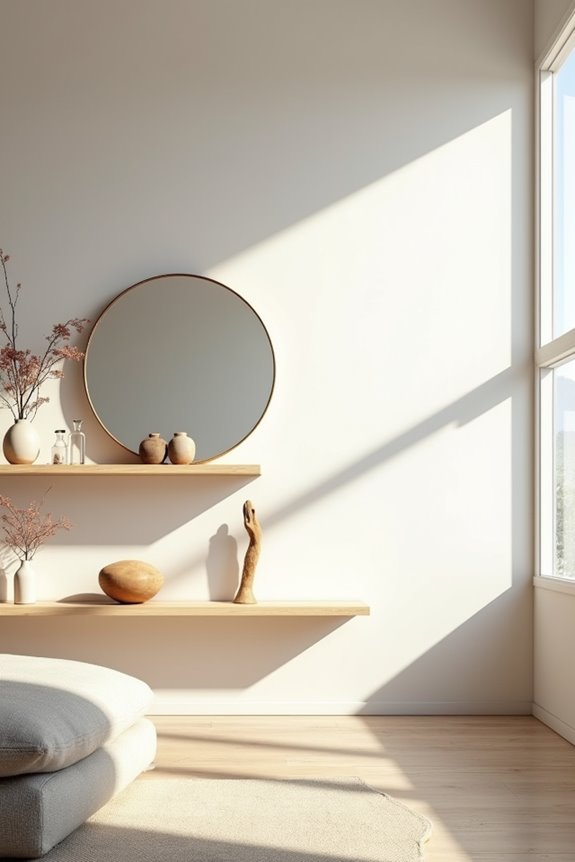
How you arrange mirrors and lighting on an empty wall directly shapes how spacious your living room feels. A large ornate mirror creates a space illusion by reflecting light across the room, making dimensions appear deeper and brighter. Position wall sconces or picture lights above the mirror to draw your eye upward, adding perceived height to the space.
The reflected light does multiple jobs because it bounces throughout your room, eliminating dark corners. Add a console table beneath the mirror, which grounds the empty wall while allowing brightness to travel freely. Pair your mirror with light-colored walls and minimal clutter to maximize openness. This combination turns an ordinary empty wall into a functional design element that expands your living room’s perceived size.
Create a Wall Vignette Around a Console
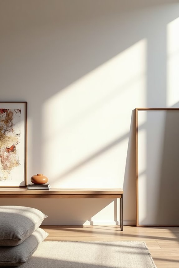
Consider building your empty wall around a console table as your anchor point. This approach creates a polished focal point for bare wall space with a curated display.
A console table serves as the visual anchor for transforming bare walls into polished, intentional focal points through curated display.
Your console vignette works best when you layer these elements:
- Vertical interest: Mount decorative brackets and place a sculptural object alongside a small plant to add dimension
- Strategic lighting: Install picture lights or sconces spanning two-thirds of your artwork width, providing balanced illumination across the display
- Balanced composition: Center framed prints or two vertical pieces within 4 inches of each other above the console for symmetry
The console functions as your foundation because it anchors everything visually. Add a pedestal with a vase or bench beneath to blend utility with visual weight. These coordinated accessories define your wall space as deliberate rather than empty.
Embrace Minimalism: The Power of Negative Space
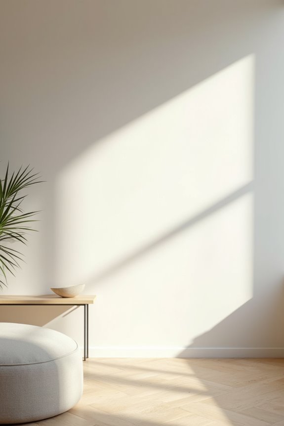
Sometimes the most impactful design choice is knowing what not to display. Negative space creates breathing room, allowing your focal point to command attention without competition. Strategic minimalism pairs one carefully chosen piece with ample surrounding wall space for maximum impact.
| Design Element | Benefit | Application | Result |
|---|---|---|---|
| Single large artwork | Defines focal point | Bare wall background | Room appears deliberate |
| Directional sconce | Highlights without crowding | Above focal piece | Emphasizes chosen element |
| Cohesive color palette | Creates visual unity | Muted tones throughout | Sparse wall feels planned |
| Ample wall space | Prevents visual clutter | Minimal accessories | Larger, more open room |
Bare walls emphasize your room’s architecture and natural light. The sparse arrangement accomplishes this by eliminating visual competition. Muted textures and single-tone palettes keep your wall feeling deliberate rather than empty. This approach defines sophistication through restraint.